
as well as a couple of close ups:
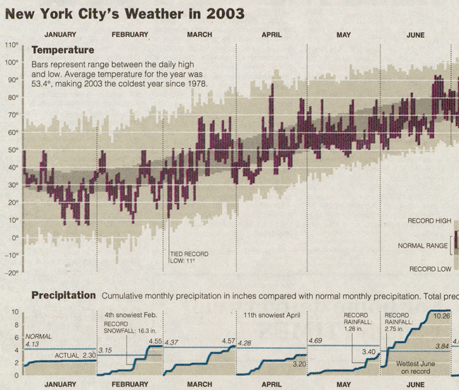
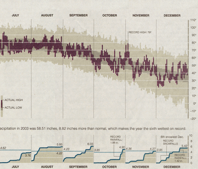
The data for record daily highs and lows and normal range allows the reader to make comparisons between this year and others, as do the normal lines in the monthly rainfall charts at the bottom.
But it's not only the information density and the presentation style that makes this so effective, it's the annotations that pick out interesting titbits here and there that bring it all together so well. We can see for instance, that June 2003 was the wettest June on record, December was the 6th snowiest and 2003 was itself the coldest since 1978. It's these small pieces of extra information that draw the reader further into the chart and make her want to spend more time studying it.
Having rediscovered this chart, I wanted to make my own version of it for Cambridge. And here it is. See Flickr for larger versions.

It's done all in excel and is a bit of a 'cheat'. There are actually 4 different charts sitting on top or next to each other. After a quite a bit of fiddling about with the arrangement and annonatations, I copied it all into into Gimp and saved it as a png file.
The data comes from the weather archive of the Digital Technology Group at the University of Cambridge.
No comments:
Post a Comment